Wednesday, 2 April 2014

Evaluation

Throughout the six week assignment i have photographed a theme of zombies on various locations,I have been able to photograph zombies through the use of special effects make up. My ideas have developed through the assignment, at first i was a bit sceptical on how i was going to shoot zombies in both rural and urban locations,my initial idea was to shoot in the studio as super impose  on to rural and urban locations and also turn the models into zombies through the use of digital manipulation but i did not get the outcome i had intended for. Through the collaboration with Hair and Media students i realised i was able to shoot all in camera on location there for getting the instant results i required.
 
Initially for my studio shoot i used the following equipment:
Bowen's lighting
Nikon D3100
Flash sync adaptor
Apple Mac image manipulation software (Photoshop cs6)
I used the following techniques to achieve the end results:
 After trying to manipulate using photoshop and not getting the desired results i wanted to shoot everything in camera,this meant playing to my strengths collaborating with other groups i.e Hair and media a technique i believe is very sucseful and i aim to use these conextions for future shoots.
For location shoot with Flo and Lanna i used the following equipment:
Nikon D3100
Make up - L3 BSDC learners.
Adobe Photoshop (CS6 and Elements 10)
 I am very happy with the overall outcome of these images shot within Burton town centre, i did not use flash within any images, We went to twelve different locations around burton that were both easy acsess but also out of the way for most people, to reduce the amount of people in the shots, see image 1 as you can see there is a lot of unnessasery colour and people within the frame, so if you look at image 2 you can see that i used the blur tool on photoshop to blur the background as well as desaturating the image to draw all the attention towards flo.


Image 1
Image 2


The initial problems were that i was unable to get the desired outcomes using digital manipulation, the way i got around this was to go back to the drawing board and shoot everything on location in camera, leaving digital manipulation to a minimum. The main success to the problem solving, was to approach the people with more knowledge in the area of special effects, such as make up and media design. The walking dead series have greatly influenced my work, as they have shot on location both rural and urban. Also the zombie walk in Paris 2013 have too influenced, with looking at the zombie walk it gave me the great idea to shoot at night when the lights are a lot darker, meaning the images would be a lot creepier and scarier.

I am extremely pleased with my final pieces of work I think it looks a lot different to other submissions, I would defiantly shoot the theme of zombies again as I have many more ideas that I was not able to shoot. I would change minor little details like the location used, maybe go to a busier city or town and change the depth of field in camera so that I have a narrow depth of field and just isolating the models with the people in the background just going about their daily lives. Collaborating with other people is defiantly playing to my strengths I will be using this skill in further shoots as it has opened up many new doors.


Dawn of the dead 1978

I am looking at the dawn of the dead 1978 film for inspiration for my zombie theme shoots for locations used make up used etc.

I like this image as i am instantly drawn to the location used, what with it being in a shop you would associate crowds, and i like the reflection used to the right of the image,i like the framing of the image and also the use of two other models in the background.


This image is so capturing, i am drawn to the use of special effects,and the grasping hand on the back of the woman's neck its almost as though the zombie is making sure she does not move her head so he can have a great big bite without any hassle of movement.


two page spread research

I have looked at the following magazine two page spreads for inspiration on how and what to put on my two page spread, whether i should have a paragraph of text, or just have a line or two or if i should stick to just having the pictures.
I have seen that the two page spreads have a bold heading, and a couple of paragraphs of text. im unsure if i will be putting too much text on my two page spreads, as i dont want to take any distraction away from the images.


Lanna re-shoot in studio

I did a re shoot in the studio with Lana, she did her own skeleton make up again,as inspired by the I-D magazine i initially researched. Bellow are my contact sheets and i have also edited a couple of the images as shown below.


The following images are my favoirtes:
_MG_2446.JPG
_MG_2458.JPG
_MG_2454.JPG
_MG_2455.JPG
_MG_2459.JPG
_MG_2483.JPG

Warm bodies

I am looking at the modern zombie movie Warm Bodies


I like the use of the rain within the image, and also the models face as he  does not look at all fazed by the rain, i also like the blood stain on his shirt, its always about the minor details in the image, I like the detail around the eyes too as they are engaging.
I am drawn to this image, because of the use of colour, it is not dark and gory with the make up and there is a lot of colour used, I like the depth of field within this image. I also like the location used.

Night of the living dead

I am looking at Night Of The Living Dead for inspiration i have fount the following pictures from the following link:https://www.google.co.uk/search?q=night+of+the+living+dead&source=lnms&tbm=isch&sa=X&ei=glYoU6OnCMGb0QXi14HgCg&ved=0CAcQ_AUoAQ&biw=1320&bih=969#facrc=_&imgdii=_&imgrc=7WxaiQXFii85DM%253A%3Bhtc0auaPXVIIYM%3Bhttp%253A%252F%252Fwww.atomicpopcorn.net%252Fwp-content%252Fuploads%252F2009%252F09%252Fnight-of-the-living-dead.jpg%3Bhttp%253A%252F%252Fwww.atomicpopcorn.net%252Fnight-of-the-living-3d-dead%252Fnight-of-the-living-dead%252F%3B640%3B479


The first thing i see when i look is the black and white picture in the graveyard, my eyes instantly go straight to the young girl who looks as though she is in a hospital gown, i believe this to be because she is in the brightest clothing


I love the original zombies,no blood and gore good old fashioned black and white scary zombies. i like the lack of gore in this image as it is still daunting. 

David Boyd

I am looking at David Boyd as he is lead photographer for the walking dead series, i  have fount the images from the following website:http://library.creativecow.net/kaufman_debra/Behind-the-Lens-David-Boyd/1


When i look at this image i am instantly drawn to the two reflectors used,i also like that natural lighting is used even tho it is on a film set


I'm aware that the following image is not one that has been taken on set of the zombies but again i like the layout of the camera set,i believe the white plastic is used as a reflector to the side of the camera.


This image was taken on the set of walking dead, i like how pale the sky is as it does not distract the eyes away from the models, i also like the fact that andrea in the background has blood splatter on her neck and arms its all about the small details in the image that really capture my eye.

Walking dead inspiration

I have chosen to look at the walking dead series. The bellow images are rather graphic, but I like the detail in them, the images were taken on the set of walking dead, so have a staged feel to them. 


I like the image to the right, as I like the depth of field, and the  detail within the eyes, I like the location used because it is rural and there are no distracting buildings.

I Like the image to the left , I like the way it is framed, I also like that the shot is in a built up environment giving the feel that it could happen to anyone, in everyday situations.
I am instantly drawn to this image as once again it is based in  a built up enviroment,and I love the way the model is looking directly into the camera ,as they eat flesh, I also like the way there is another zombie in the background and what seems to be a human crying on her knees.

Zombie walk 2013 paris


I have chosen to look at 'Zombie walk' i have fount the following images from the following website:http://www.behance.net/gallery/Childhood-Zombie-Walk-Paris-2013/11825029
 
I am instantly drawn to the colour of the image. The dark eerie background with the bright foreground,  I feel the blood works well on the yellow jumpsuit and it instantly make me think of a biological hazard when I see the mask and yellow jumpsuit.


I am  intrigued by the following image.
I like the attention to detail shown within the make up, the split face almost looks clown like, with the smile which seems all engaging, but then you look closer and you see the sharp piercing teeth.


The following image represents  That anyone can become a zombie ,no matter what job they have. I am instantly drawn to the piercing eyes. The eyes in this image instantly catch my eye, and draws me in. I like the way that the medical scrubs have been used with blood splatters and on the right arm of the zombie in the foreground  it looks like a small hand print.

I-D magazine cover

I produced four cover images, and i then went on to selecting the final cover as Lanna in the studio.

I like this cover, i like the black background with the hint of red, the ID logo on this cover has to be bigger, to cover 1/3rd of the page. I also like the texture of the background as it is rough, the red text works well as i associate red with danger,and skeletons/zombies are dangerous. 
This is my favorite and i will be using this image for my cover, i have edited the saturation and i like the way there is a green hue to the image, the only area of improvements are that the ID logo needs to be a little bigger, and the barcode needs to be a little smaller. 
 This cover image is not as strong as the above two images, but i like the depth of field in the image, and the green text adds a sense of horror and the location works with the theme again.


 I was hoping to use this image the cover as the model is smiling looking directly into the camera and his hair covers his eye nicely, this image is a good portrait but is not relivent to my theme of zombies, i was aiming to edit the image to have a zombie bite, but i didnt get around to it.

ID magazine cover research and initial cover

We were given the task to research ID magazine covers, to give us inspiration when we had to produce our own cover we then had to go out on three different locations and take images relating to our theme and also we had to include the I-D wink. 


The following I-D magazine covers inspired me:
 I like the splash of colour, on the models face. with the bright background, yet the background does not draw attention away  from the model.


 I also like this  cover, i like again the pattern on the models eye,i love the simplistic background.


I love this cove, the half skeleton face, links closely with my theme of Zombies, i like the fact the image has been turned black and white, it draws me in closer to look at all the detail within the skeleton. 
Here are two of my covers i have produced:


The first cover bellow is an experimentation with colour, i was looking at the layout, i like this one, but it is not my favorite, i dont believe the red colour goes well with my theme as it is vibrant and too colourful. i also believe it has too much on, as the above covers are rather minimal.


Next is my second cover i produced, i prefer this one as i like the colour used, the green goes well with my theme as it is still vibrent but  it has a good connection with the theme also the cover is not too packed and rather minimal. which works well, as the text does not casue any distraction away from the model.


I was able to make these covers, by the following:
Opening a new tab in photoshop to a international paper size A3
Dragged the image (IMG_7411.JPG) into photoshop
Got the I-D logo, dragged that onto the image
Dragged barcode onto the image
Removed the background colour of the logo using mask tool
Added text (A-Z fun and games)
Added text (model Lanna Macdonald, Photographer Sarah Pastre)


Lanna and Flo Zombie photo shoot


Bellow are my contact sheets of the shoot i did on monday 17th March with Flo and Lanna
in the middle of Burton town center.


Images:
DSC_1140.JPG 
DSC_1141.JPG are test shots as i was making sure that all the detail was in the face.
I like the following images: DSC_1143.JPG
DSC_1147.JPG


Luke Fashion shoot

I booked the studio for a zebra themed shoot the bellow images are of the contact sheet, i
 initially intended for the model to be wearing a zebra onesie, but it did not fit. so the model had black and white clothing that i represent to be zebra colours.


The following images are my favorite and i might look at editing them to see how they look for the front cover.
DSC_0994.JPG
DSC_1004.JPG
DSC_1009.JPG
DSC_1018.JPG
DSC_1022.JPG
DSC_1035.JPG


Louise, Ali and fin zombie photo shoot

I did a photo shoot in  the studio with Ali,Louise and Finley, i aim to digitally manipulate the images so that the models look like  zombies. bellow is my contact sheet of the images taken within the shoot.


 I am instantly drawn to the following images: _MG_1350.JPG
_MG_1359.JPG
_MG_1360.JPG
_MG_1362.JPG
_MG_1363.JPG


Fill a gap

We had a mini taskto go out and fit as much colour into a small confined space as possible. bellow are my contact sheets of the images taken:
Instantly i am drawn to IMG_6937.JPG and IMG_6940.JPG


Fill a gap mini task (willi dorner research)

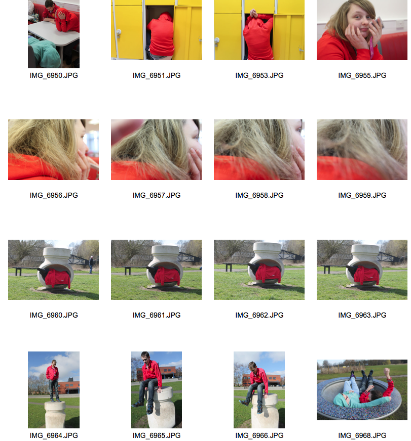
We were set the mini task of producing images relevant to Willi Dorner who does body sculptors, bellow are some of his images that inspired me to produce the images: